

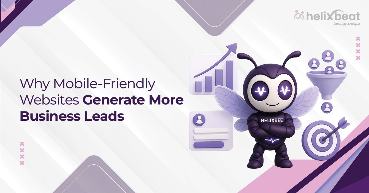
Mobile held 51.04% of worldwide desktop-vs-mobile market share in May 2026. Customers now discover, compare, and contact brands from smartphones. That is why mobile friendly website benefits are directly connected to lead generation, not just visual design.
For Helixbeat’s digital marketing service, web design is a growth tool. Helixbeat’s digital marketing services focus on SEO, SEM, user engagement, and conversion improvement, so the mobile journey becomes part of the full business growth system.
StatCounter reported that mobile held 51.04% of worldwide desktop-versus-mobile market share in May 2026. Google also explains that it uses the mobile version of a site’s content for indexing and ranking through mobile-first indexing. These facts make mobile friendly website benefits important for visibility, trust, and enquiries.
Table of Contents
Why Mobile-Friendly Websites Matter
The practical mobile friendly website benefits are clear:
- Visitors stay longer
- Users understand your services faster
- Contact actions become easier
- SEO traffic gets a better landing experience
- Paid ad clicks have a better chance of converting
Helixbeat connects mobile friendly website design with measurable marketing outcomes, and these mobile friendly website benefits become stronger when design, SEO, and CTAs work together.
1. Better User Experience
Google uses the mobile version of a site’s content for indexing and ranking. Good mobile friendly website design makes browsing effortless. Visitors should not zoom or struggle with tiny buttons. They should be able to read your offer, understand your value, and take action in seconds.
Strong mobile friendly website design is usually built around simple usability. A better mobile experience includes:
- Clear headlines
- Readable font sizes
- Easy navigation
- Tap-friendly buttons
- Fast-loading images
- Simple contact options
- Proper spacing
One of the strongest mobile friendly website benefits is that users feel in control. When a site feels easy, visitors stay longer and explore more pages.
2. Higher Mobile Search Visibility
Search visibility depends on content, speed, technical structure, and usability. Businesses that want to build mobile friendly website pages should focus on:
- Responsive layouts
- Clear heading hierarchy
- Lightweight images
- Clean internal linking
- Fast mobile speed
- Easy-to-read service content
These mobile friendly website benefits help search users find your business and interact with your pages confidently.
3. Faster Customer Actions
Mobile visitors often arrive with high intent. They may want to call, request a quote, send a WhatsApp message, or get directions quickly. If those actions are hidden, leads are lost.
To build mobile friendly website journeys that convert, action points should be easy to find. Useful mobile action features include:
- Click-to-call buttons
- Short enquiry forms
- Sticky contact bars
- WhatsApp enquiry links
- Map and direction buttons
- Fast quote request buttons
This mobile friendly website benefits area is easy to measure through call clicks, forms, and CTA engagement.
4. Improved Lead Generation Forms
Forms are a common weak point on mobile websites. Small fields, too many dropdowns, and unclear error messages reduce submissions.
If a brand wants to convert website to mobile friendly, forms should be reviewed first. Helixbeat recommends shorter forms that ask only for essential details first.
Mobile form best practices include:
- Fewer required fields
- Large input boxes
- Autofill support
- Clear labels
- Simple submit buttons
- Visible privacy reassurance
Better forms create direct mobile friendly website benefits because fewer users abandon the enquiry process.
5. Lower Bounce Rates
A visitor may leave within seconds if a mobile page loads slowly or feels confusing. Google has shared that 53% of visits are likely to be abandoned if mobile pages take longer than three seconds to load. For WordPress websites, teams should optimize website for mobile wordpress by checking theme speed, plugin weight, caching, image formats, and Core Web Vitals. This supports mobile friendly website benefits by keeping users engaged long enough to act.
6. Stronger Local Search Performance
Local customers often search on mobile with immediate intent. They may compare providers, check hours, and call directly from a website.
A strong mobile friendly website design supports local lead generation through:
- Location-based service pages
- Click-to-call contact options
- Google Business Profile consistency
- Local testimonials
- Map integration
- Fast-loading location pages
If you serve a city, clinic area, store location, or service zone, mobile matters even more. In local marketing, mobile friendly website design can be the difference between a missed visit and a new enquiry. Strong local mobile experience helps users find, trust, and contact you faster.
7. Better Website Trust
Trust begins before a visitor reads every word. If a mobile website looks broken, outdated, or difficult to use, the business may seem less reliable. The best mobile optimized websites use simple design, secure browsing, testimonials, proof points, and easy contact access.
Trust-building elements include:
- HTTPS security
- Clear service information
- Reviews and testimonials
- Consistent brand visuals
- Case studies or proof points
- Visible phone and enquiry options
These mobile friendly website benefits help visitors feel safe sharing their details.
8. Improved Conversion Rates
Traffic becomes valuable only when it converts. If the mobile experience is poor, the business may still receive very few leads.
To convert website to mobile friendly with conversion in mind, focus on the full path from landing page to action. Helixbeat’s responsive website development service focuses on fast-loading, device-optimized websites that improve user experience and measurable business growth. This makes it easier to build mobile friendly website experiences that support paid ads, SEO, and social campaigns.
9. Competitive Advantage
Many businesses still send mobile traffic to desktop-first websites. This creates a gap between marketing spend and results. The best mobile optimized websites help businesses stand out because they feel modern, easy, and dependable.
For brands planning a redesign, Helixbeat’s blog on scalable, user-centric web development is a useful internal resource for businesses planning stronger mobile experiences. Helixbeat’s blog on DIY vs professional web development is also relevant for teams updating older websites with stronger technical support.
Non-Mobile Website vs Mobile-Friendly Website
| Area | Non-Mobile Website | Mobile-Friendly Website |
| User Experience | Hard to read and navigate | Smooth browsing with clear content |
| Design | Layout breaks on small screens | Responsive structure adapts to devices |
| Lead Capture | Forms and buttons are difficult | Short forms, click-to-call, and visible CTAs |
| SEO | Weak mobile usability | Better mobile crawling and page experience |
| Trust | Looks outdated or unreliable | Looks professional and accessible |
| Business Impact | Higher bounce and fewer enquiries | Better engagement and lead generation |
Common Mobile Website Mistakes
Fixing these issues improves mobile friendly website benefits across both SEO and conversion. Common mistakes include:
- Text that is too small
- Buttons placed too close together
- Heavy images
- Too many pop-ups
- Long forms
- Hidden contact details
- Slow page speed
- No real device testing
WordPress businesses should optimize website for mobile wordpress regularly, especially after theme changes, plugin additions, or landing page updates. A technical audit can help optimize website for mobile wordpress before paid traffic is scaled. If a site has old layouts or poor speed, it may be time to convert website to mobile friendly through a professional redesign.
To achieve results like the best mobile optimized websites, every page should be tested for speed, readability, CTA visibility, form usability, and search performance.
Final closure
The most important mobile friendly website benefits include better user experience, stronger mobile search visibility, faster customer actions, improved forms, lower bounce rates, better local discovery, stronger trust, higher conversion rates, and competitive advantage.
For growth-focused businesses, mobile friendly website benefits are too important to ignore. These mobile friendly website benefits become stronger when strategy and execution work together.
Helixbeat helps businesses connect web design with digital marketing performance. By combining responsive development, SEO thinking, user experience, and conversion strategy, Helixbeat creates mobile-ready websites that do more than look good. They help generate business leads.
People Also Ask
Why does every business need a mobile-friendly website?
Every business needs one because customers search, compare, and contact brands from smartphones. A strong mobile experience improves trust and leads.
What are the 7 C’s of a website?
The 7 C’s of a website are commonly understood as context, content, community, customization, communication, connection, and commerce. Together, they help create a useful and conversion-ready website.
Why is mobile advertising becoming more popular?
Mobile advertising is becoming more popular because people spend more time on smartphones and take quick actions from mobile ads. Mobile ads perform best when the landing page is also mobile-friendly.
What are the benefits of having a user friendly website?
A user-friendly website improves navigation, engagement, trust, form submissions, conversions, and customer satisfaction. These are also core mobile friendly website benefits for business growth.